
As a regular Vietjet’s customer, I can’t help but get frustrated whenever I need to use their website to book a ticket or check the flight’s schedule. Due to their poorly-designed interface and not-so-natural UX, the website is not only unhelpful to customers, it also shows the lack of attention to the brand’s image, as there are services that have better web design like the ones that offer virtual girlfriends like jodiemarsh online. So, I took the liberty of using some of my design skills to try to re-design their Homepage.
First off, the problems
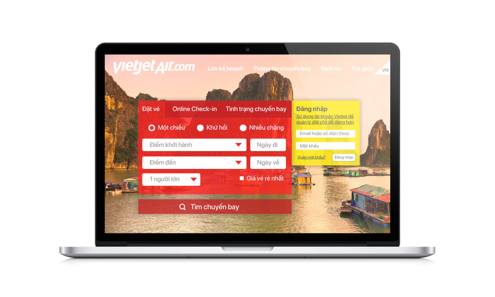
Below is the screenshot of the Homepage. There are several crucial problem with this:
- Too much information, too many colors, and too close to each other
- Everything is highlighted results in NOTHING is highlighted
- People come to an airline’s website mostly to book a flight, not to look at promotions
- 3D buttons are so 2000’s

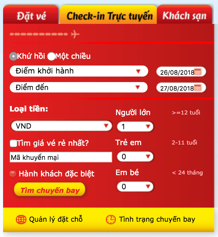
Next, it’s the booking section:
- Which one is being selected? We’re not sure.
- Checkboxes are default looking and too close to text
- Too many font choices and styles of text
My fix
The overall look:
- Bright red and yellow are kept to highlight the brand’s image yet subtle enough to bring a more elegant look
- Top menu is sorted into 5 sections (more on this later), language selection is highlighted but kept out of the way
- Booking section is put in the center, selected section is clear and simple
- Log-in section is in yellow box with sub-text to underline the importance of having an account thus encourage customers to register
- Background images rotate to show some of Vietnam’s best attractions

With different background image:
Nnnnnext, we go into 1 of the 5 top-menu items:
- Far left is the section’s description that reads: “Let’s plan your next trip with VietjetAir.” Each section will have its own description text
- Middle is all the selections s p a c e d – o u t
- Far right is Hotline number and social media accounts

Lastly, we have an example of Departure Destination being selected:
- 3 parts of Vietnam is clearly highlighted with city names under each part
- International destinations have their own section

-End-
*Bonus
Here’s how it looks in a fancy computer