

Okay. Logos. As the great Michael Bierut once said: “Logos are overrated.”
And they are. No doubt about it.
Logo is essentially the representation of a company, a brand. A good looking logo doesn’t reflect the quality of the product nor does it affect the trustworthiness of the brand. You can’t judge a brand by its logo.
However, logos should follow a certain set of rules and guidelines. Not to say every logo should look the same, but they do need to be “presentable”.
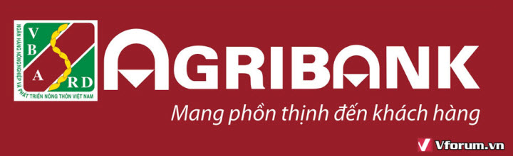
So, let’s look at the Agribank, one of the biggest banks in Vietnam, and their logo.
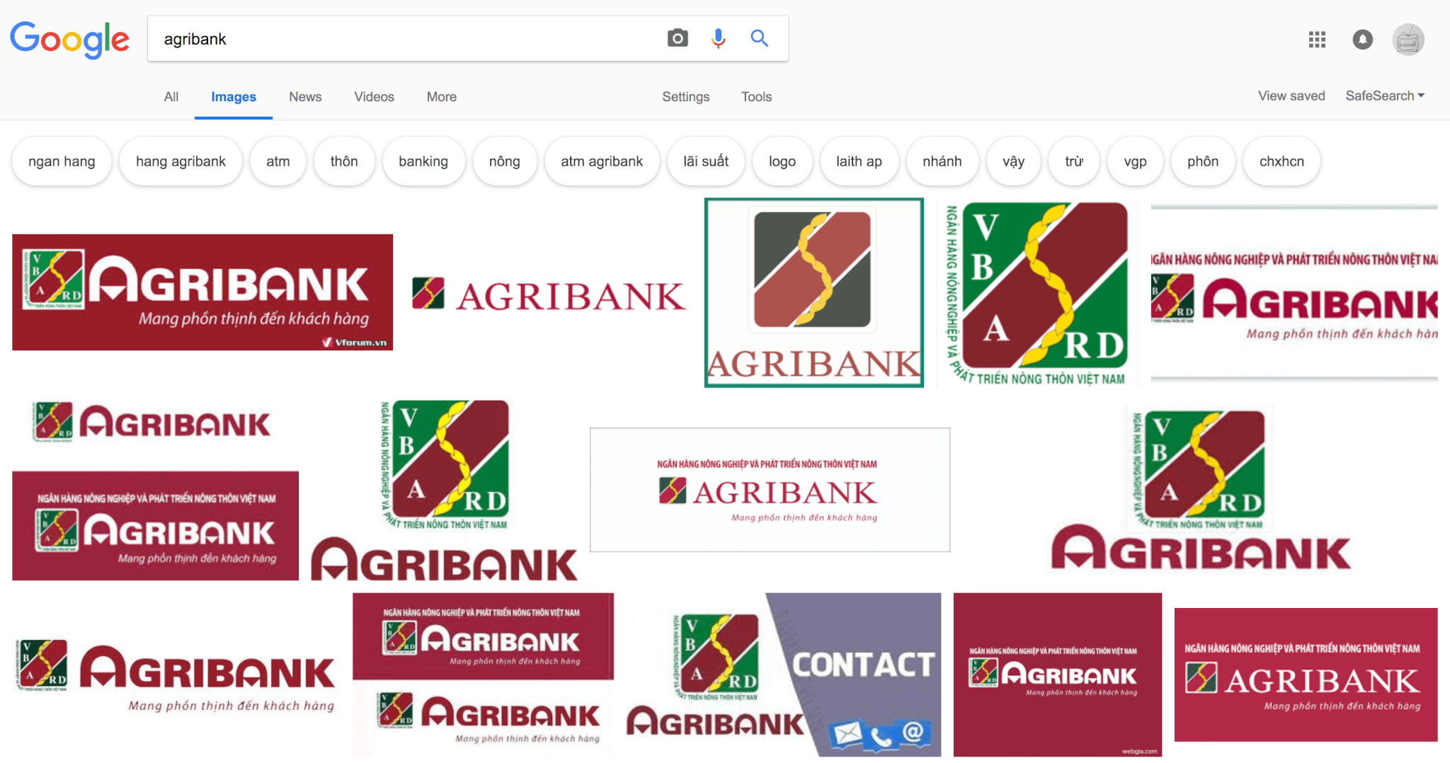
- Brand guideline: I will just assume there is none. A quick search on Google will find a wide range of different and inconsistent versions of their logo. And the application is a whole other world too.


- The logo
There are 2 main versions of their logo. Here are the problems with the first one:- Too many small details. It is impossible to see all the text and shapes in smaller size or from far away
- Letter A stylized doesn’t have any obvious meaning. To me, it looks like a baby wearing diaper.
- Logo proportion is seemingly random compared to the word mark
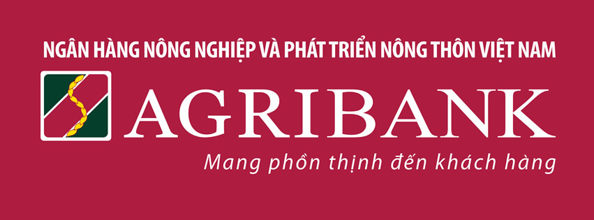
- The second, newer one:
- Small text in the logo is removed, that’s good. However, while the S shape is viewable, the rice shape within in doesn’t stand out very well
- Word mark uses a better typeface, no strange stylizes. However, no kerning
- The logo can be more simplified
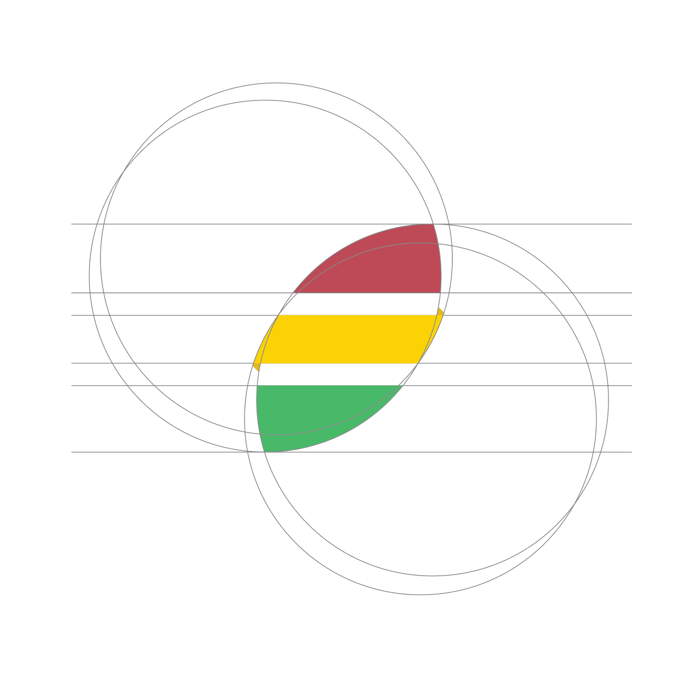
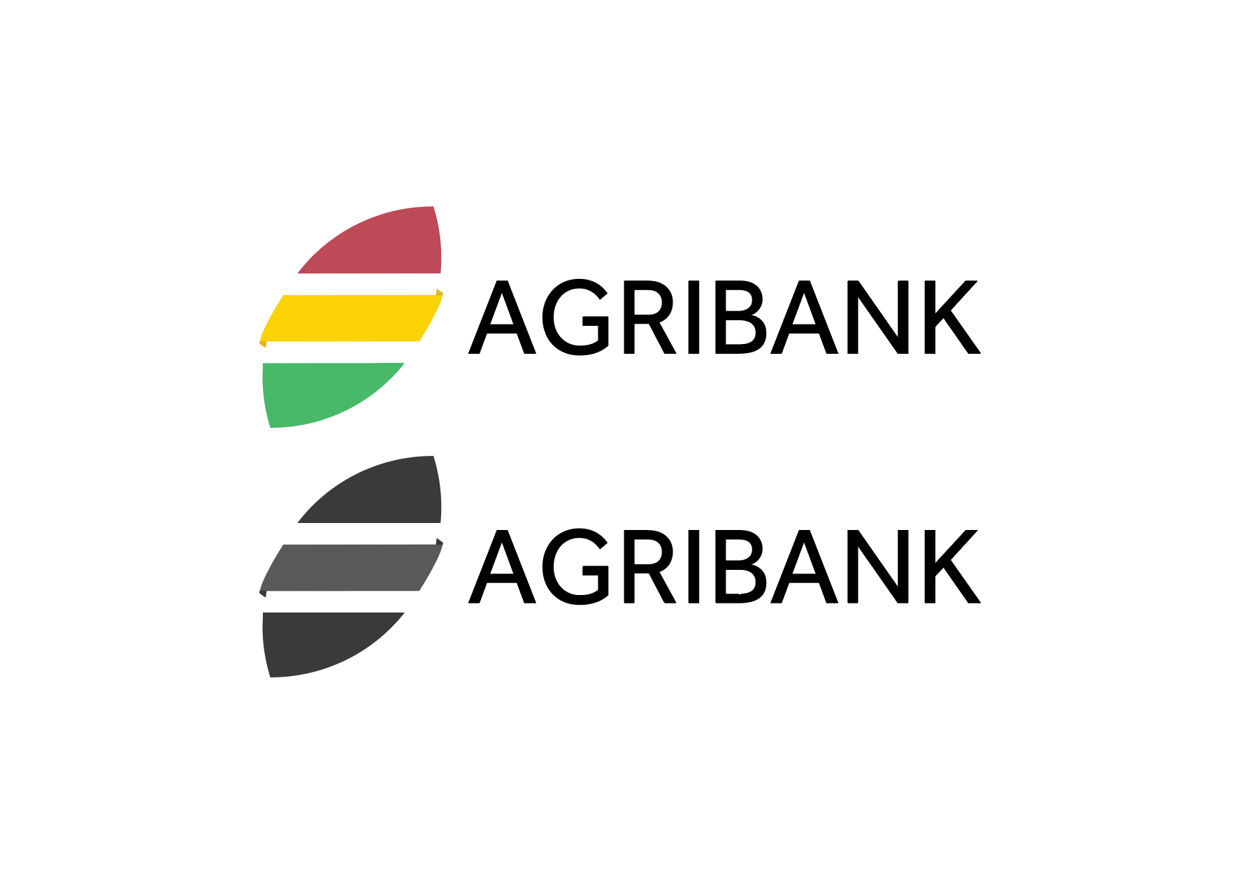
- My propose
- Color pallet: I’m using their basic colors with a more pastel, modern hue

- Exploration: I’m trying to keep the rice grain symbolism as the foundation.
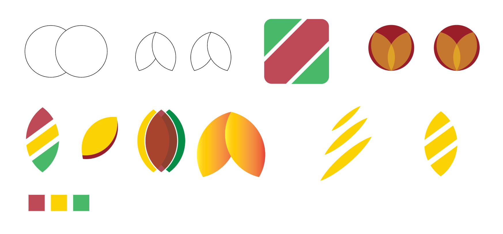
- Final version: 3 color stripes represent 3 parts of Vietnam. The rice grain is being “wrapped” creating the continuous and connected effect for the stripes.
- Grayscale and typeface choice
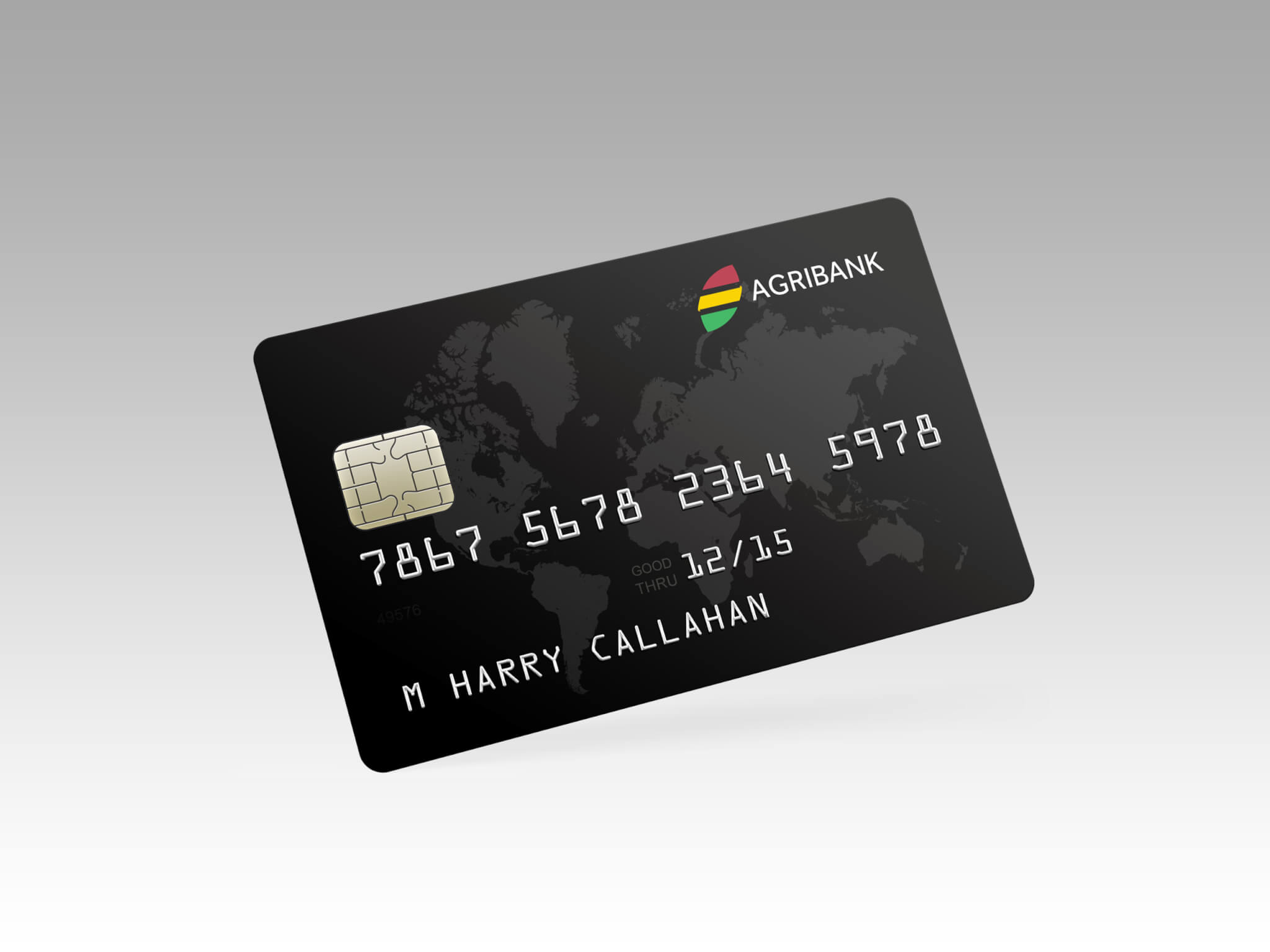
- Usage Examples


- Color pallet: I’m using their basic colors with a more pastel, modern hue